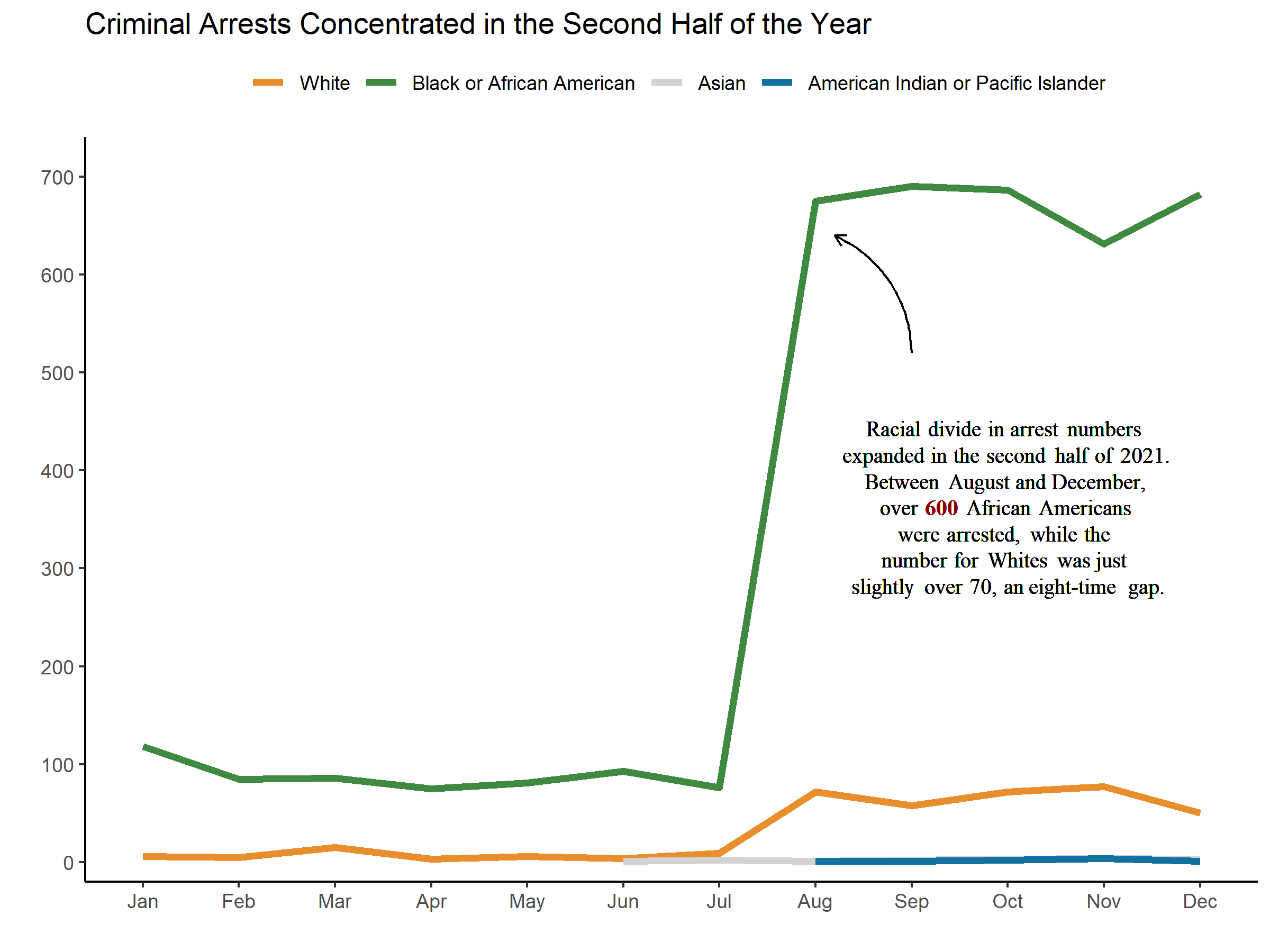
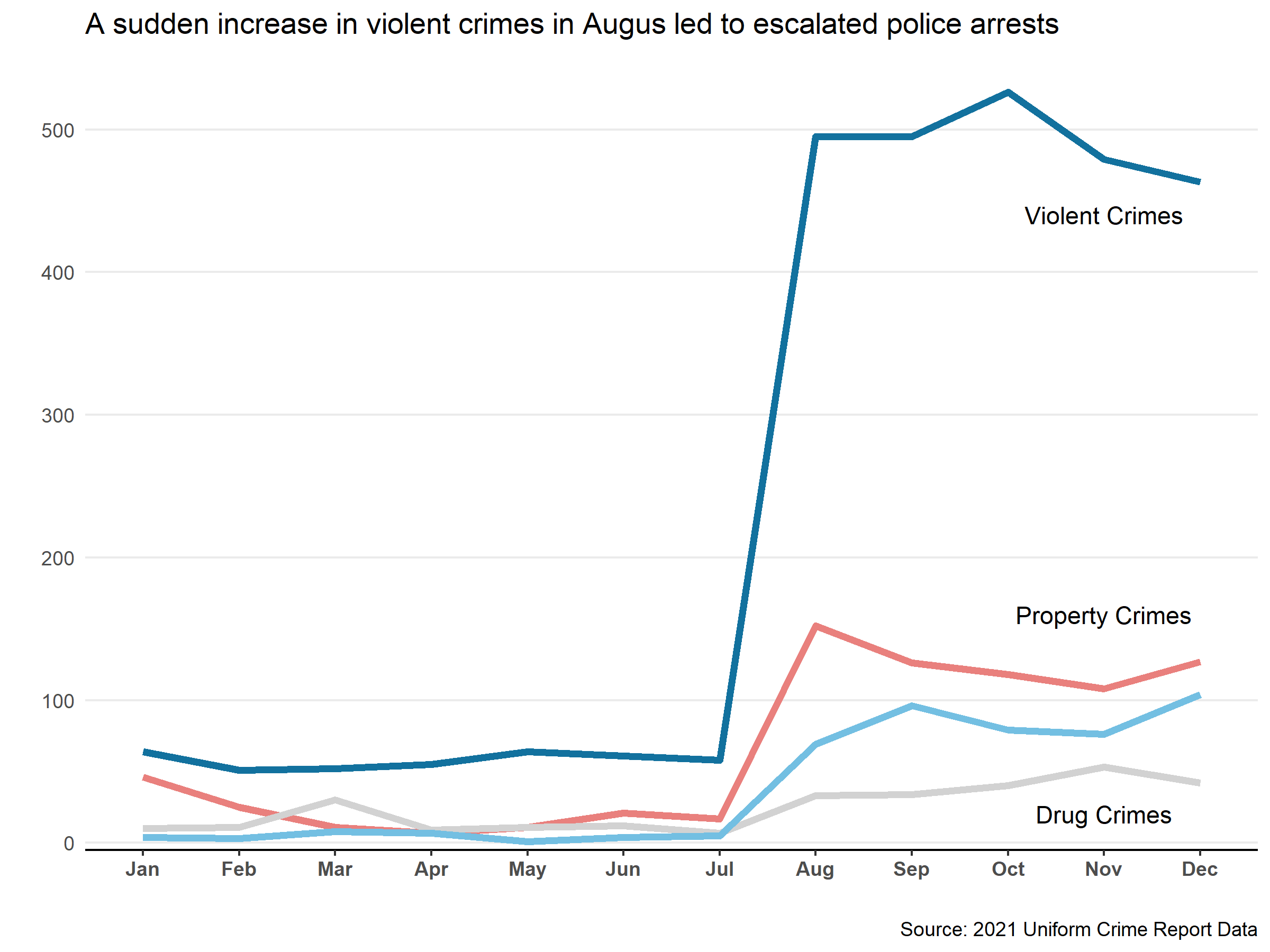
Line Chart
(Unless specifically noted, all graphics below are made in R using ggplot)
Bar Charts
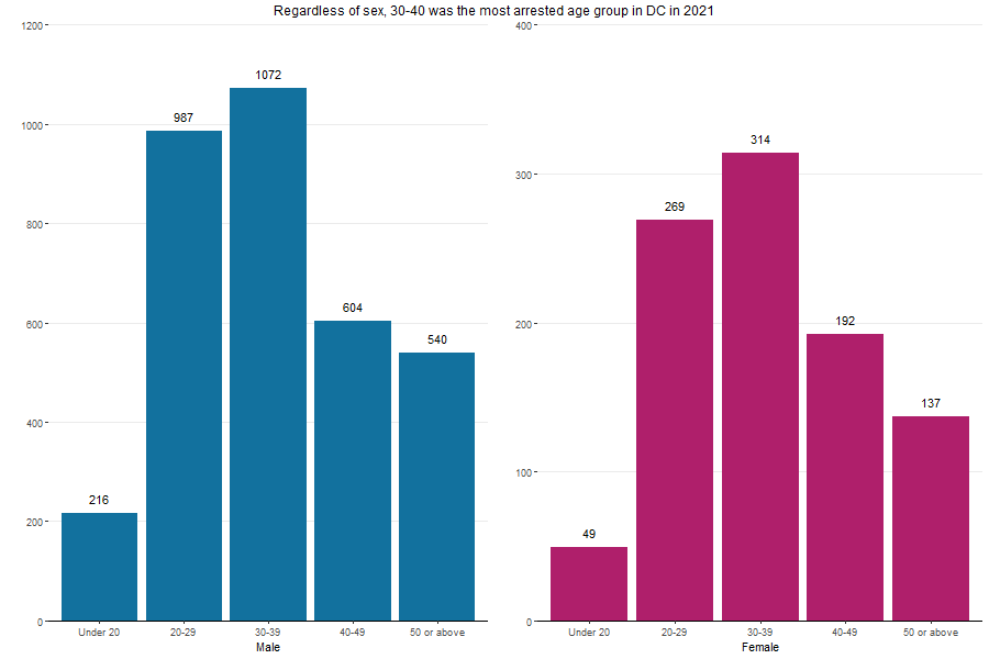
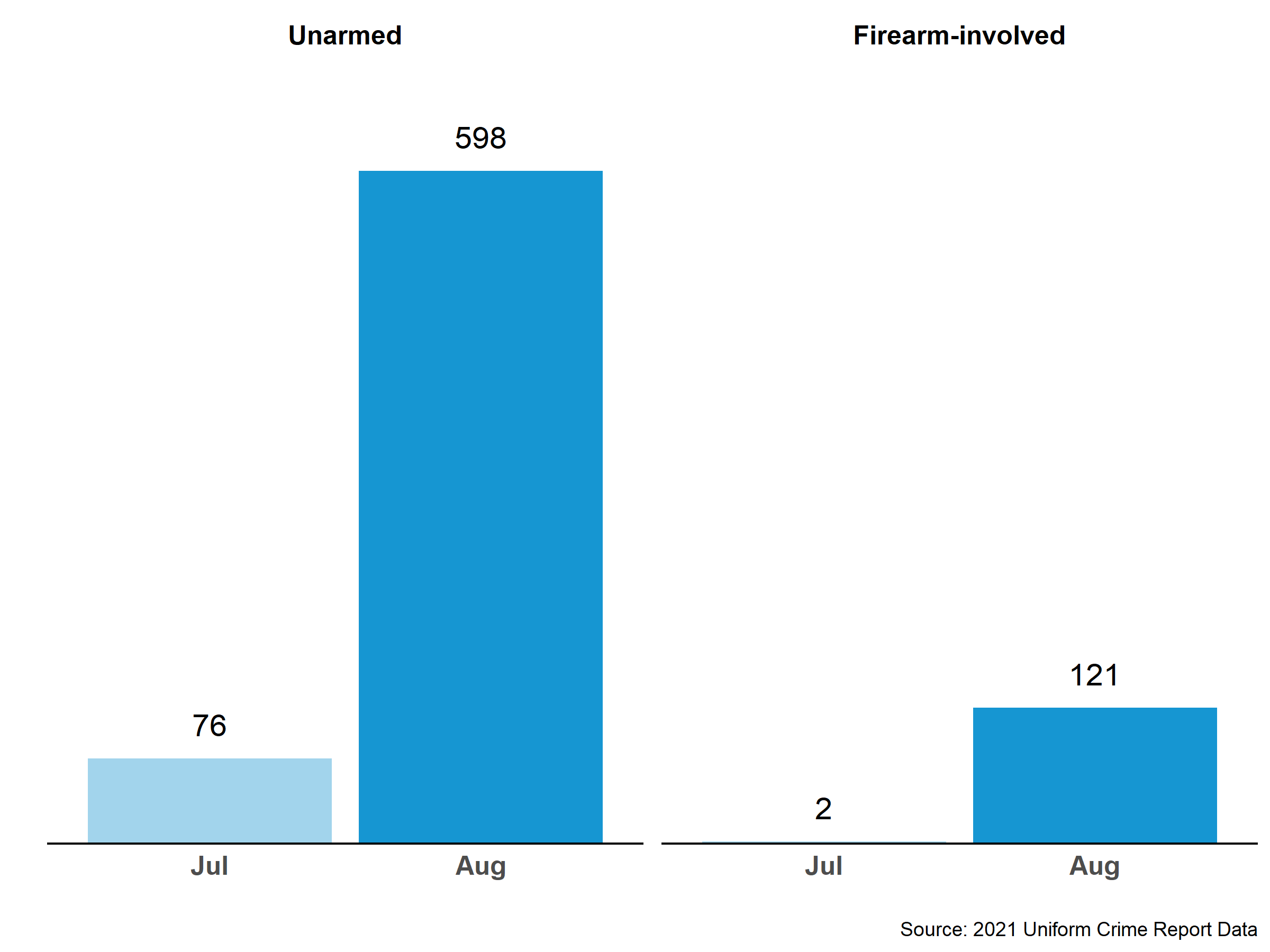
Faced bar charts
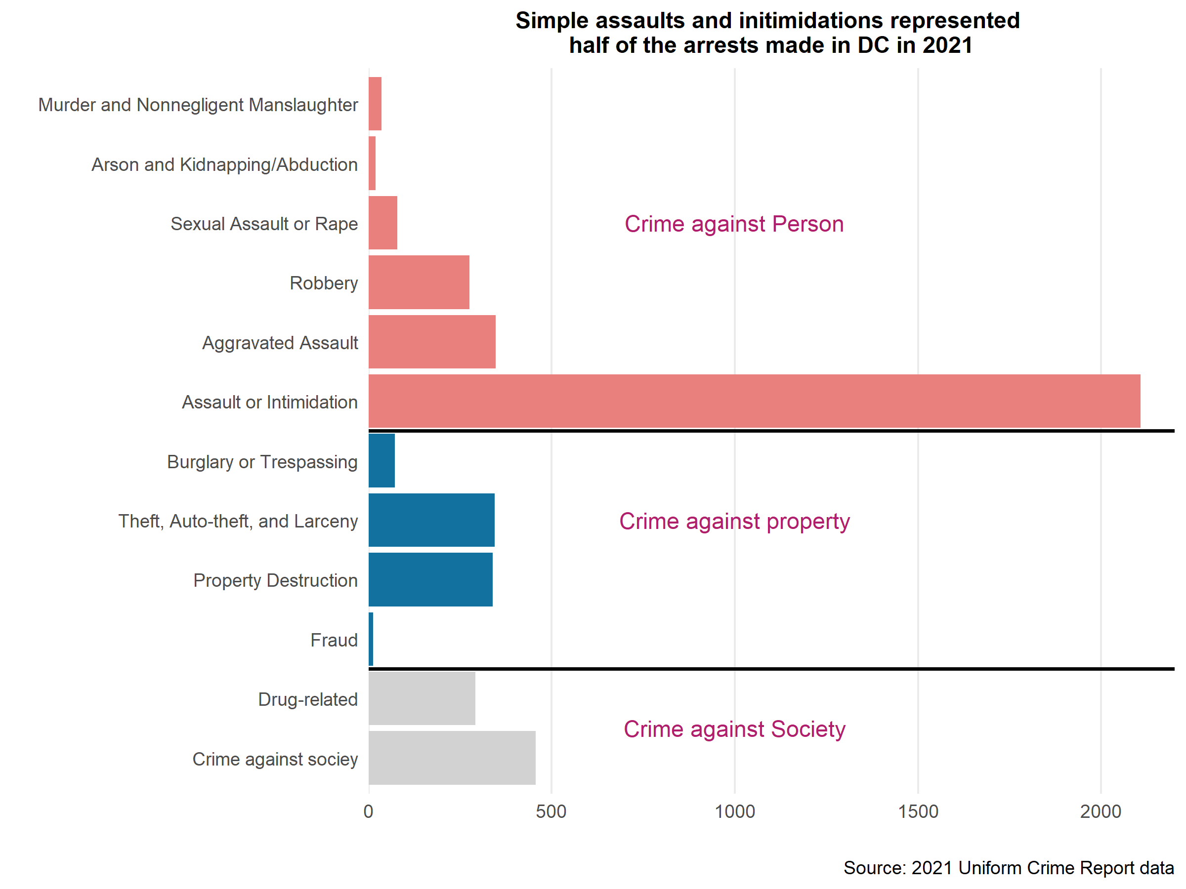
Horizontal bar charts
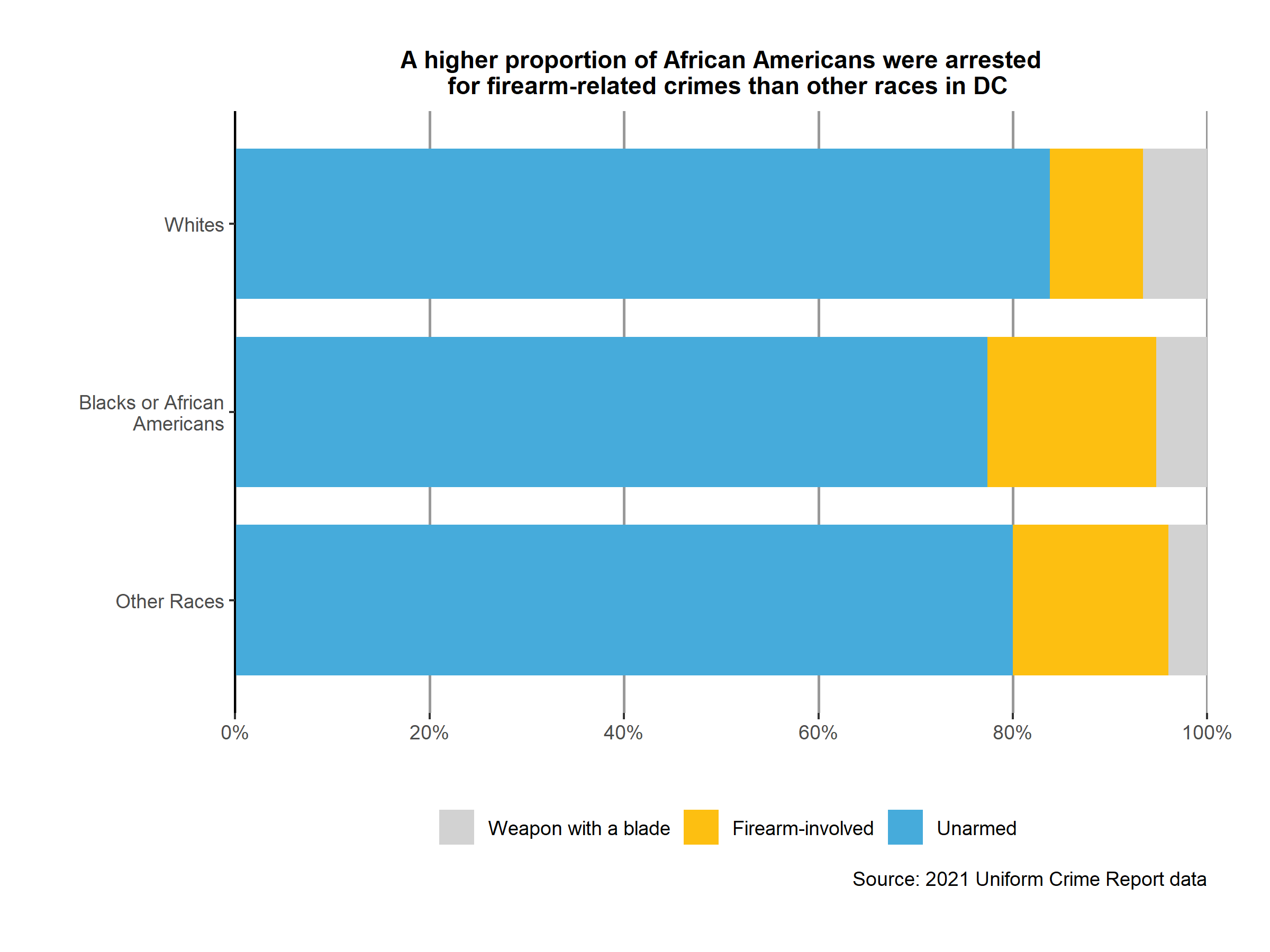
Stacked bar charts
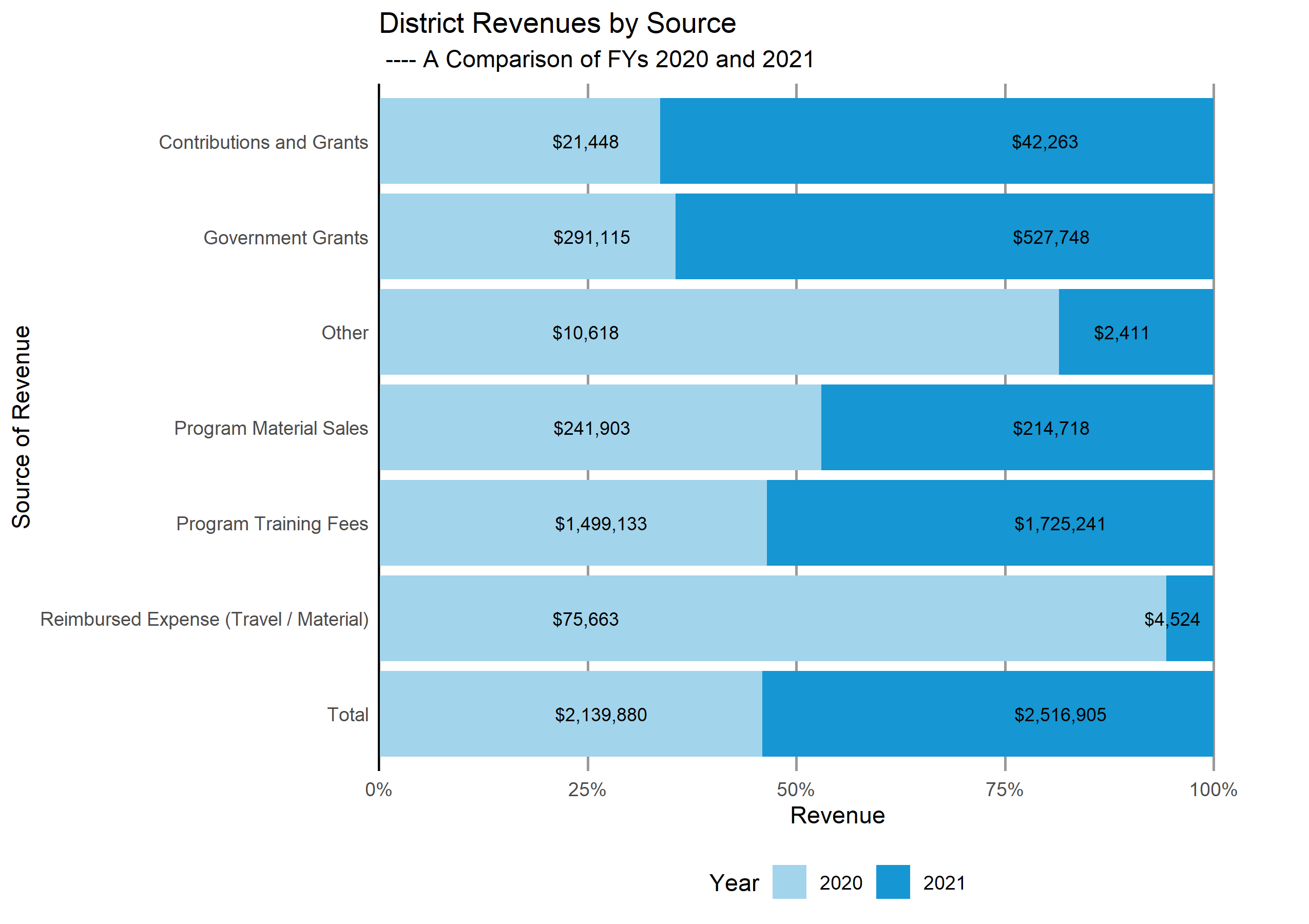
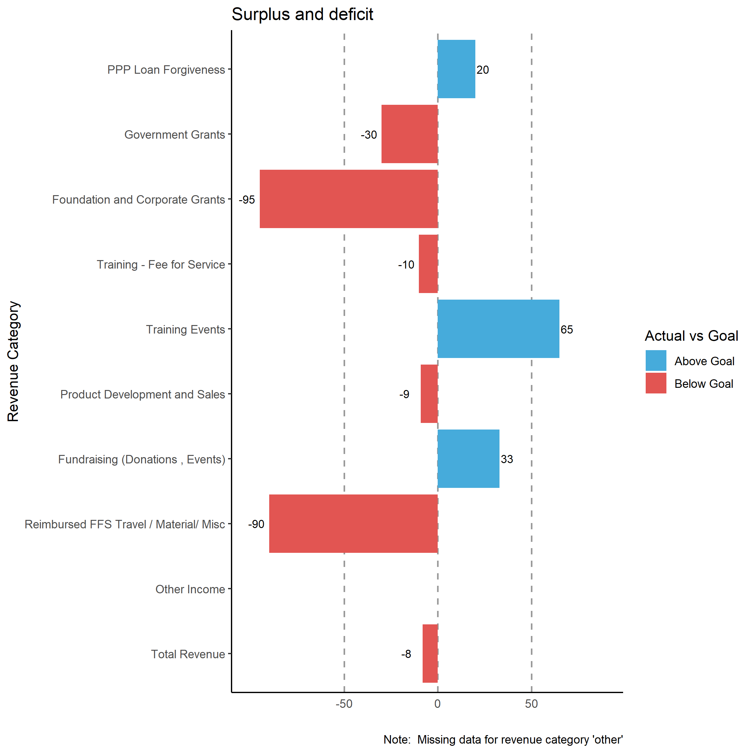
Diverging bar charts
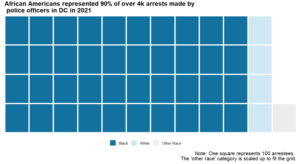
Waffle Chart
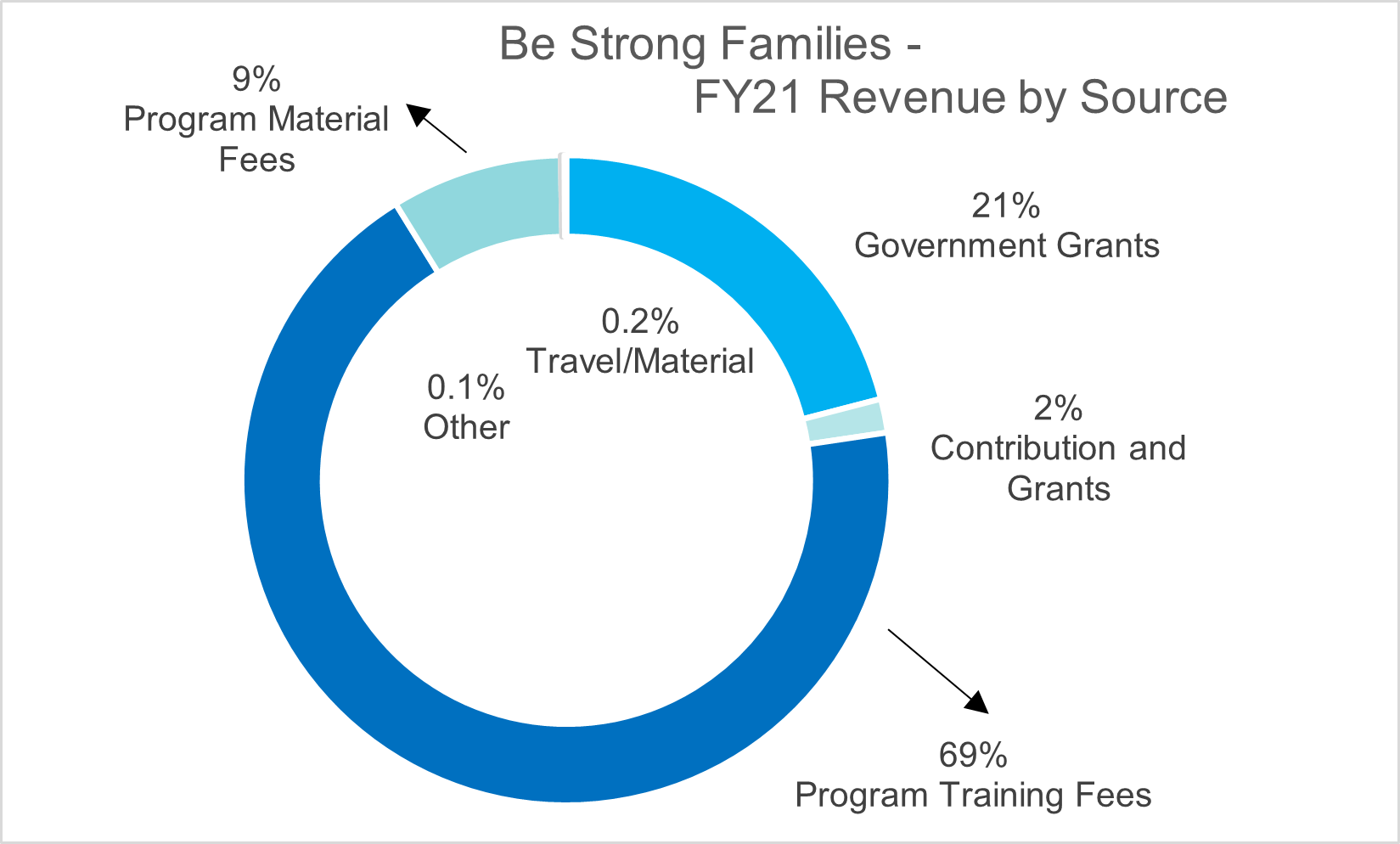
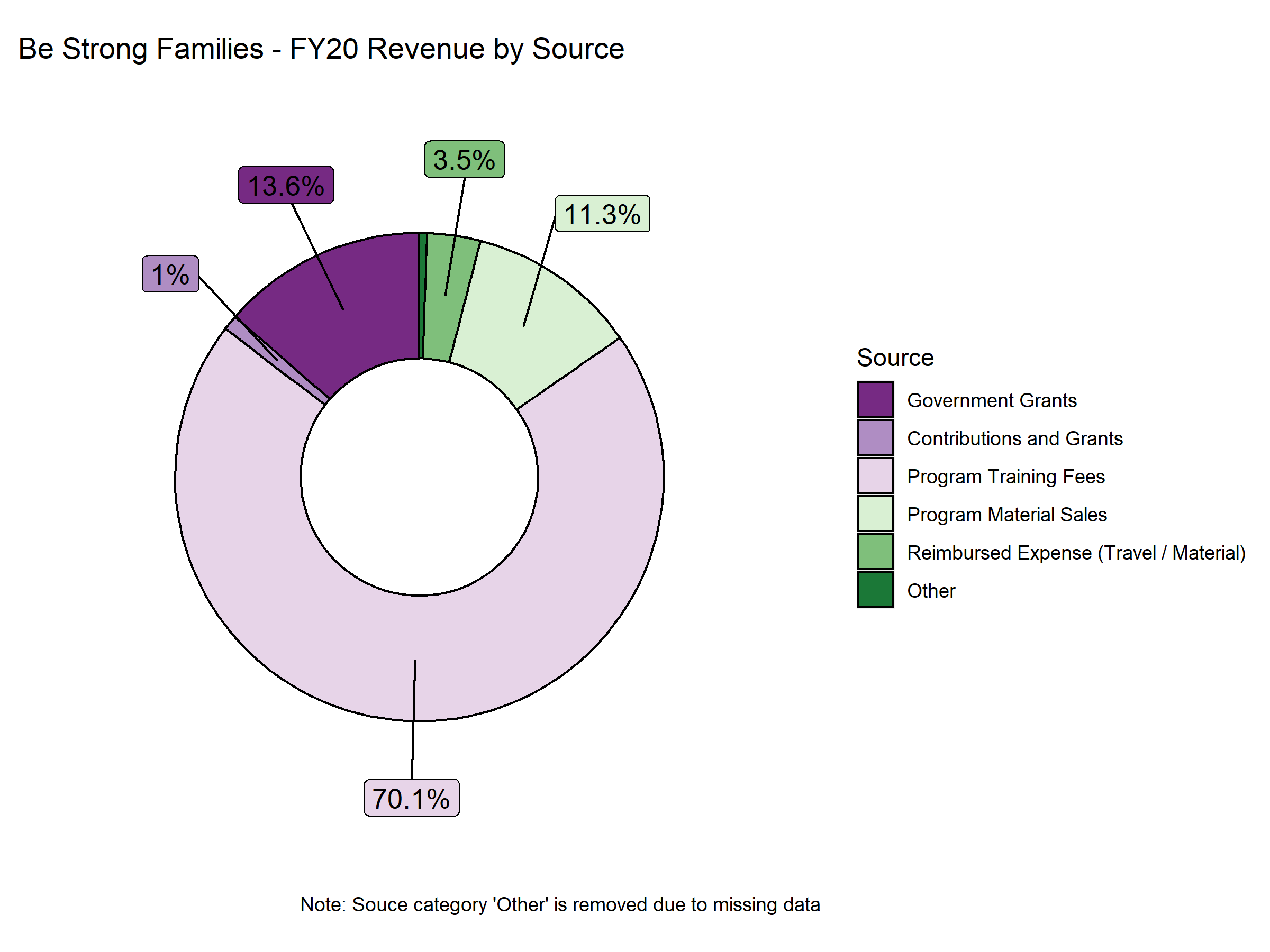
Pie Charts/Donult Charts
- Note: Pie (donult) charts are often highly recommended against within the data science community. However, in professional settings, both charts can offer a good way to show sizes of different categories, should they be clearly annotated and the number of categories is few (usually the rule of thumb is <= 5 categories). If the purpose is to compare, I highly recommend using other charts instead. Some good alternatives include bar charts and line graphs.
(This one is made with R:)
(This one is made with Excel:)
